Results
A redesigned console customers rated as having 66% more functionality and 12% easier to use
After taking in user feedback from usability testing and final critiques from my stakeholders, I created 3 design iterations and delivered a full redesign of the dashboard, checks page, and preferences screen, as well as reimagined their main flows. I successfully created a redesign with current customer insights at the center of the process.
In my usability study, 7 external/internal users rated the redesigned console as:
66% greater functionality and useful features
12% easier to use, worth the higher learning curve
All would use the redesign more frequently
Challenges
Designing for a complex tool and unfamiliar user
I came into this internship with no prior knowledge or experience in cloud computing and designing for more technical users, like DevOps or cloud architects. Quickly learning how TA works and how different users typically manage their cloud environments were definitely a challenge I initially faced, but after my research, I was able to familiarize myself with this type of tool and user.

Working from home, holding meetings, creating balanced schedule
While I’m grateful that I was still able to work this internship in the middle of the pandemic, there came challenges with me finding work-life balance, especially since my team was mainly based in Seattle while I was 3 hours ahead in Ohio. Additionally, holding meetings and being able to effectively communicate my ideas to many different audiences was a new experience. Over time, I became better at understanding how to maximize my productivity at home and how to communicate.

Accommodate for the 100%, optimize for the 80%
One piece of advice that stuck out to me from a design critique was the idea of accommodating for the 100% but optimizing for 80%. Although I can’t optimize the experience for all customers, I can aim to optimize for most. In my redesign of TA, I overcame the challenge of ensuring this principle.

How to formally conduct user interviews and usability testing
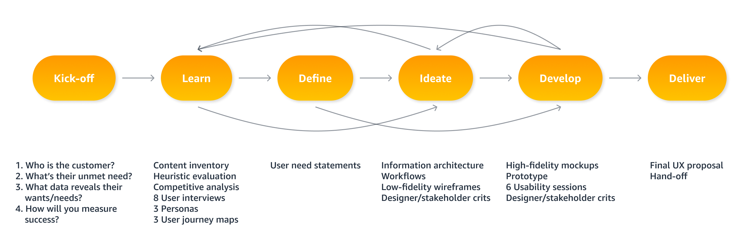
I had never formally run user interviews or conducted usability testing before. Getting to tackle the entire process, from recruiting users, to creating the scripts, to running the sessions was a great learning experience that taught me the art of truly listening to the user and digging deeper into the “why” of their insights.

Designing for accessibility
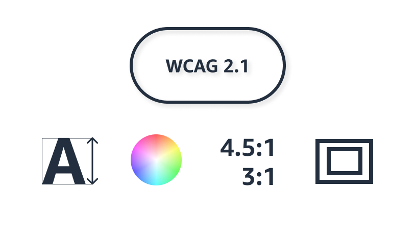
I became more aware of accessibility guidelines for text size, color, contrast ratios, and nesting elements.
