Brice Bai

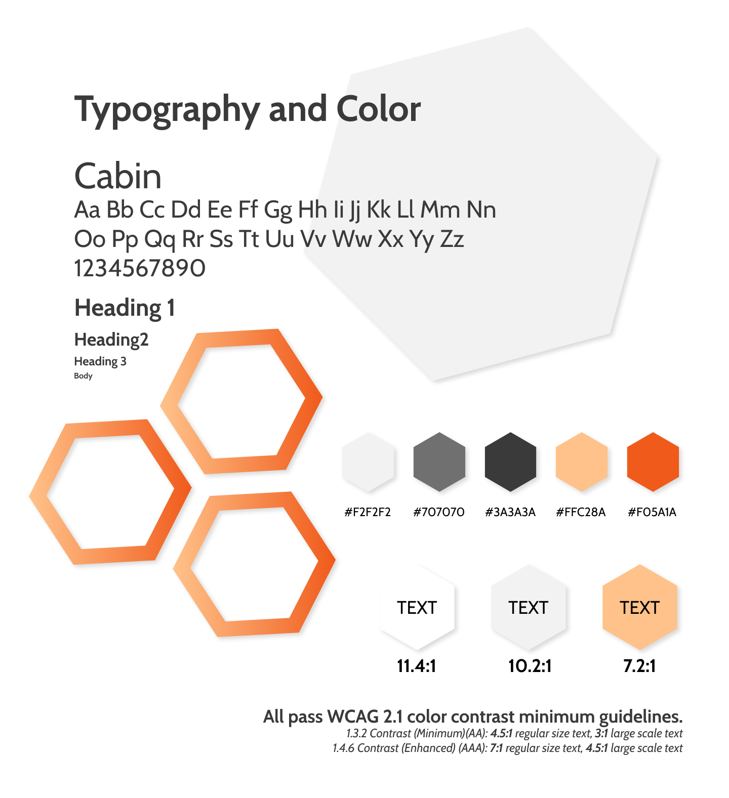
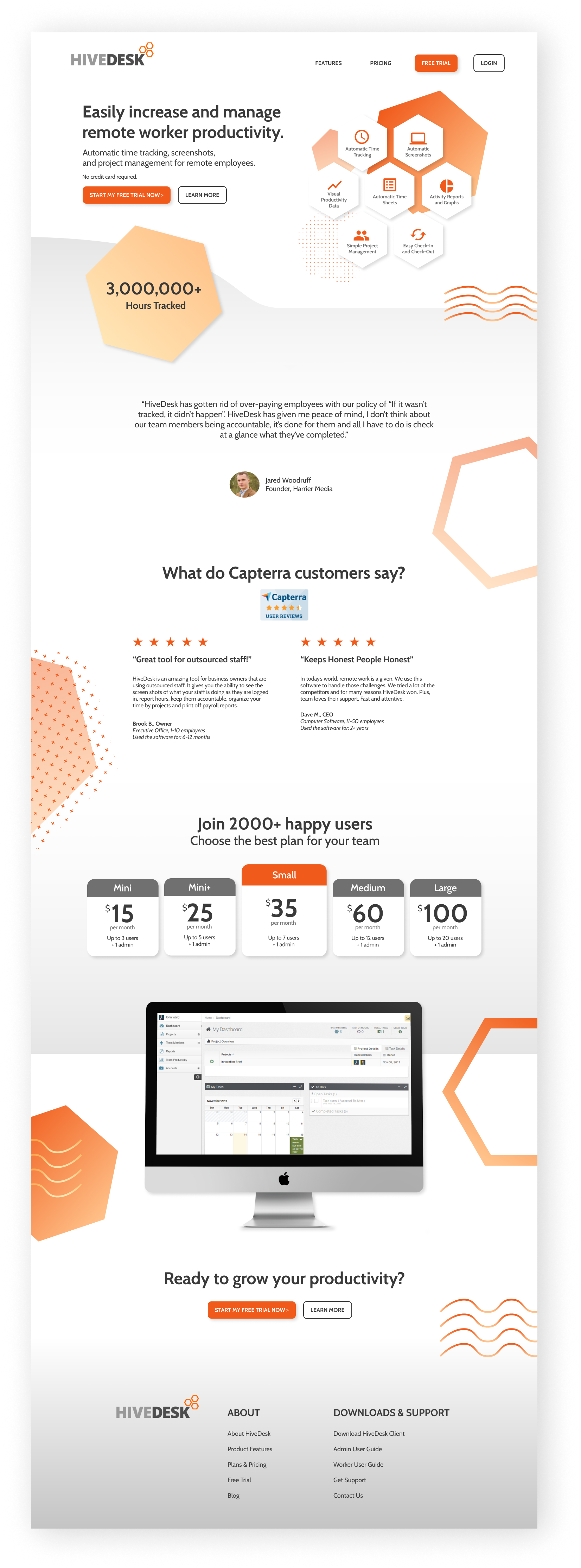
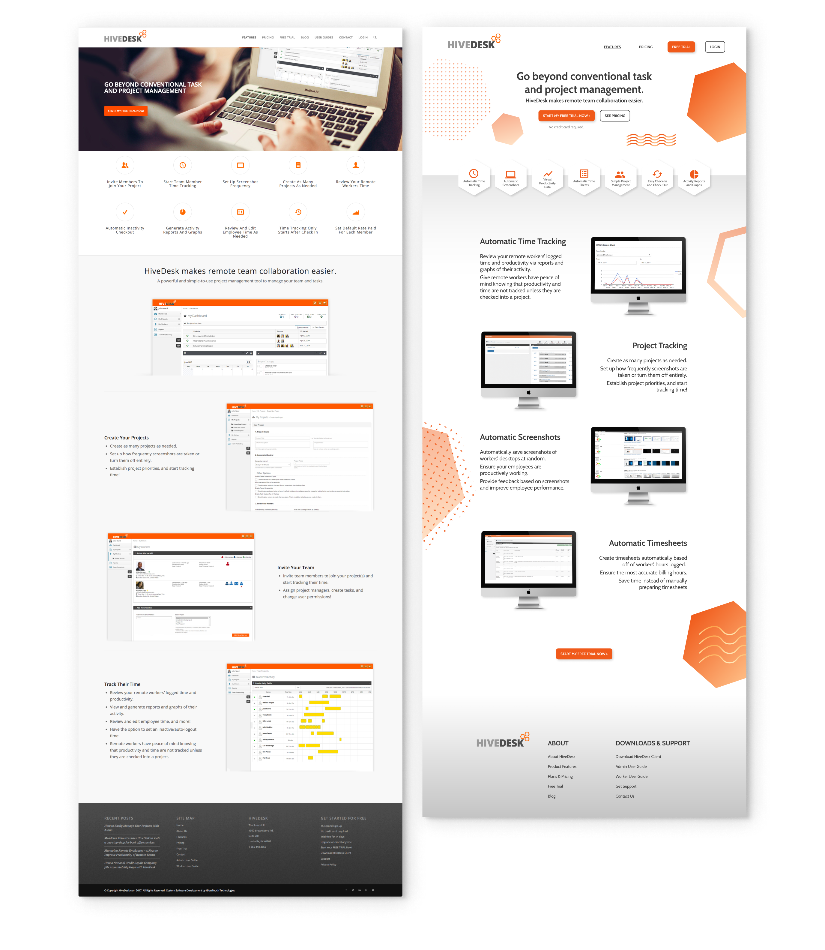
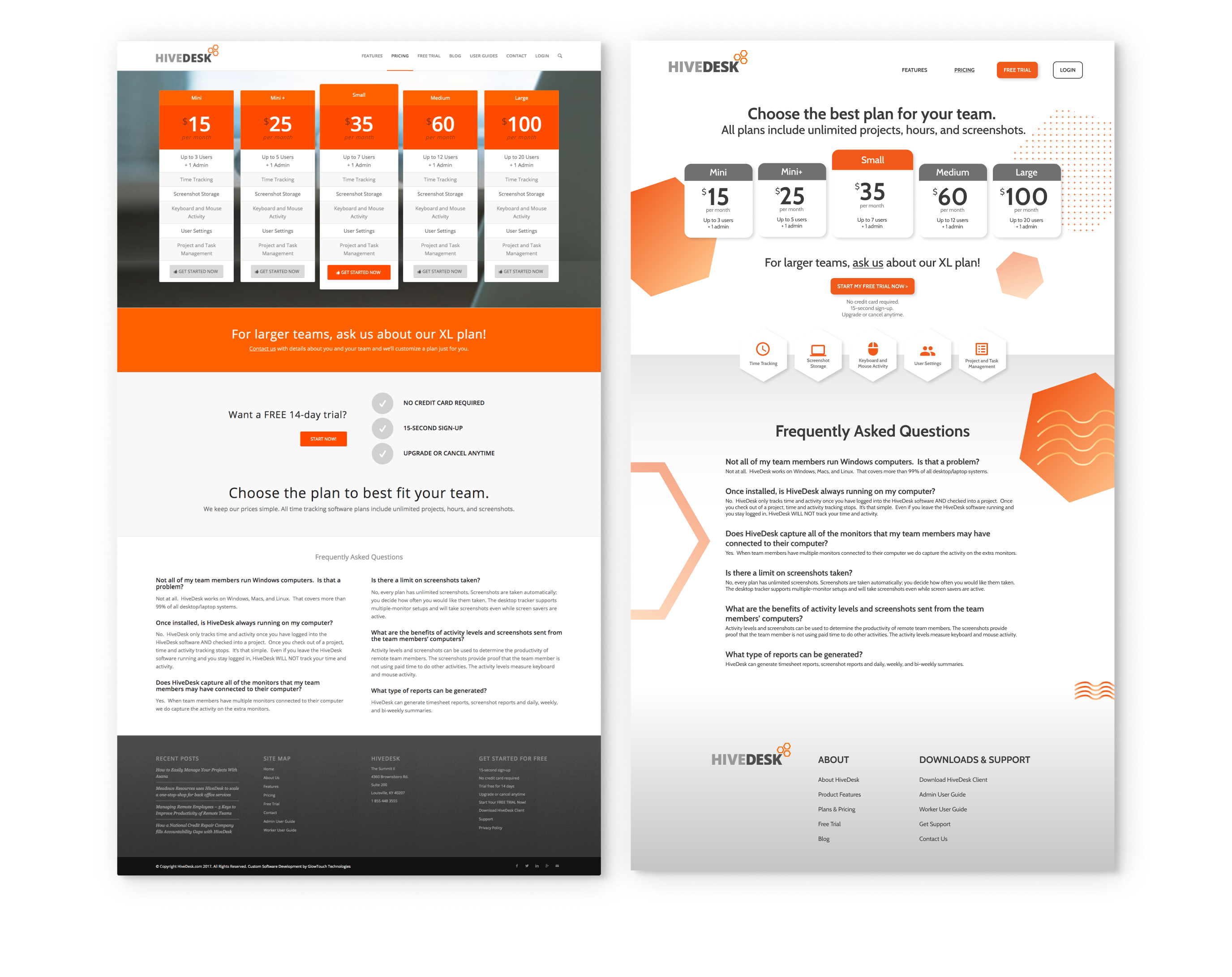
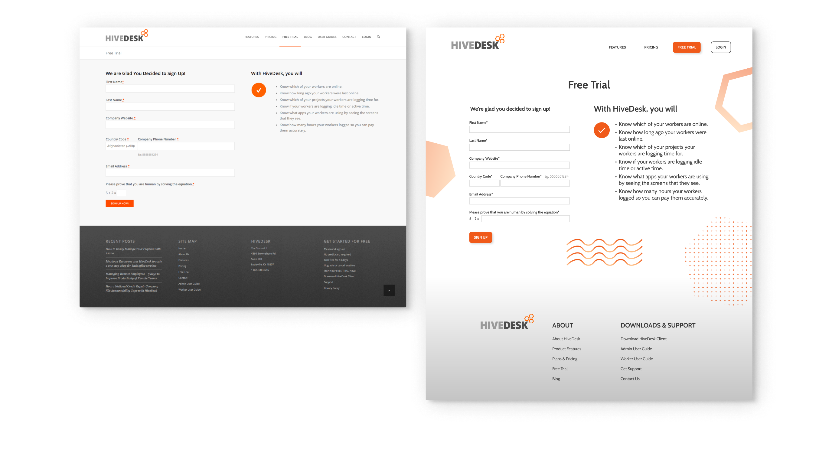
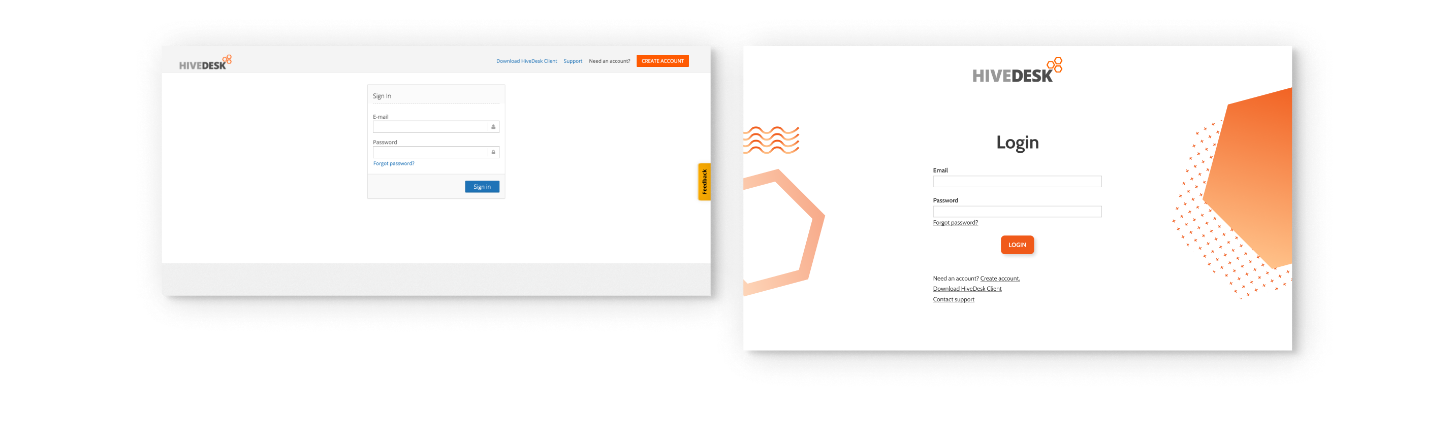
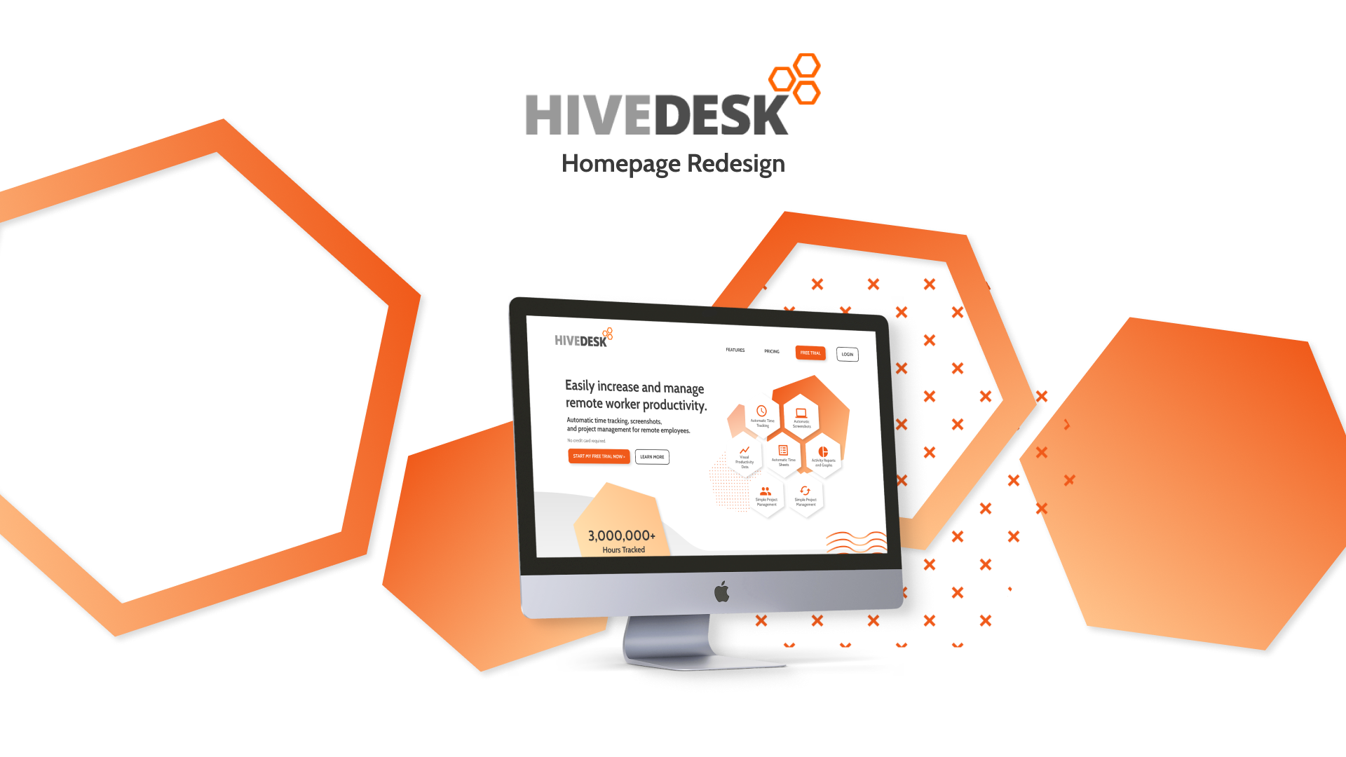
HiveDesk Homepage UI Redesign

Duration
Summer 2019
10 weeks
Part-time
Tools
Figma
Key Skills
UI, Conversion Optimization
The Team
HiveDesk Product Marketing Team


HiveDesk is a B2B SaaS product that tracks remote worker productivity by taking random automated screenshots of workers’ screens. It has a customer base in the hundreds and is managed by a small team in GlowTouch Technologies, a technology company based in Louisville, Kentucky. As a summer 2019 intern at GlowTouch, I had the opportunity to assist with the product marketing and management of HiveDesk. I was primarily responsible for implementing UI/UX design changes to their website.

The Problem

HiveDesk has been stagnating in customer growth for over a year. How can we increase the number of product downloads? How can we encourage customers to try out the product?

The Solution

Use small and easy-to-implement UI/UX techniques that influence users to move beyond the homepage and to the free trial download page. Increase user conversions and free trial downloads using low effort but high impact design decisions.

Jump to final design decisions ↓
Observations
+ Research

The need to increase CTR and alleviate user fears

The marketing team presented me with some data via Hotjar regarding the website's 1.7% CTR from homepage to free trial page as well as the number of users who scrolled all the way down the homepage funnel. Given such low rates, I was tasked to increase them through UI changes.

I was also provided websites (1, 2, 3) containing information on the challenges and fears from companies who hire remote workers. Looking through these sources, a few common pain types stood out to me:

I saw opportunities for the HiveDesk tool to resolve these pain points, so I wanted to design the homepage to target and convince the customer that HiveDesk could relieve their fears.

This is the old, original HiveDesk homepage:

I analyzed this version of the homepage and used various psychological and marketing techniques outlined by psychologist Nick Kolenda. A couple of factors immediately stuck out to me that could be changed:

Less is more—the overall amount of information on the page should be reduced to increase the user’s focus on the primary goal
Attention needs to be more easily directed to the call-to-action, especially at the top of the funnel
Goals

    Reduction to increase customer focus

    More emphasis on the call-to-action

    Relieve the fears of the target customers

Decision 1

Landing screen with stronger focus, appeal to target users, and CTA emphasis

Users are able to focus more on key information with a reduction of links in the top navigation bar and with the key features of HiveDesk summarized with simple icons and captions.

The call-to-action is emphasized more with the free trial button repeated on the top navigation bar and the landing screen.

Greater appeals to the target user are made through the headline and through the highlight of 3,000,000+ hours tracked, giving users assurance of the high usage of the software.

Decision 2

Real testimonials and reviews higher prioritized

Place real customer testimonials at a higher position in the flow to establish more credibility and relieve fears of the target user. Provide a real face and name to the reviews to increase trust.

Add reviews from a second, external platform like Capterra to increase credibility and appeal to the user.

Decision 3

Pricing plans highlighted for greater transparency

Establish greater trust with users by placing the pricing plans directly on the homepage and by highlighting the high number of users.

Add reviews from a second, external platform like Capterra to increase credibility and appeal to the user.

Decision 4

More effective final CTA with reduced flow

The user is more likely to reach the end of the homepage funnel and see another CTA, increasing the possibility of them going to the free trial page. A final headline reminds the user the benefits of HiveDesk and how to can resolve their pain points.

Process
+ Style

Wireframe

A new type and color palette were defined. I based the colors off the HiveDesk logo and ensured the text sizes and color contrast met WCAG 2.1 guidelines.

Final Design

Since the marketing and development teams mainly wanted to incorporate small, low-effort UI changes to the homepage, my redesign was not fully implemented by the end of my time at GlowTouch. The compromise was that my design decisions such as the reduction of links in the top navigation bar, the repeating of the CTA button at the top of the page, and the removal of the extraneous blocks of descriptive text were made. I described conducting these design decisions to the marketing and development teams, and they were successfully adjusted.

As a result, the CTR from homepage to free-trial-page increased from 1.7% to 2.1%–approximately, a 24% increase.

These same UI/UX techniques were applied to the redesign of the rest of the website.

Features

features

Pricing

pricing

Free Trial

freetrial

Login

login
Results

Small changes can lead to big impact.

Redesigning the homepage showed me how just a few simple changes could be the deciding factor in whether a user chooses to try out a product or not. If the user cannot be properly convinced to use the product, it will struggle to gain more users.


Future
Directions

In the future, I would like to conduct more user testing. One thing I would like to A/B test is the opening headline and header image that the user first sees upon homepage arrival. The original homepage had a headline that described what the product itself was and had a header image of the product’s dashboard pages in the background. I intentionally chose a headline that focused on the target user’s expected desires and chose a header image that would direct attention to the CTA button. Gathering data on whether these changes actually increased conversion rates would provide stronger support for their implementation.

Another design decision I would like to consider is including more highlights or descriptions of the product features. The team I was working on mainly wanted to use testimonials to build credibility and relieve customer fears, which is why I focused on including blocks with this information, but I would also want to test if including a block highlighting a feature or two would encourage users to continue down the landing page funnel.

Let's Go
Back to all of my work, or check out:

Amazon

Sleep Tight

Adobe/Nick

X.ing

Nova

CODED + DESIGNED ON bricebai. 欢迎光临 ✌🏻